Our Band Website

Click on the image to get to the website
Our Album Digipak- Back and Front

Our Album Digipak- Middle

Monday, 11 May 2015

Monday, 5 January 2015
1. In what ways does your media product use, develop or challenge the conventions of real media products?
Conventions of the genre of our production
genre: (electronic) dance
 |
| Lucid City |
 |
| Alunageorge |
Music videos for this genre are often conceptual or narrative and not performance based due to the collaborative nature of these tracks and the visual difficulties of a DJ performing (not as entertaining as a pop singer). For example many of the music videos in our stealomatic such as Route 94- My Love, Prayer in C, Major Lazor- Sweat, do not feature the artist. In our music video we challenged the conventions of electric dance videos by having performance elements as well as narrative, for example in the playing card performance scene that can be seen below...
 |
| Route 94 "My Love"- no performance or artist featuring |
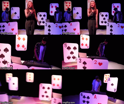 |
| Lucid City- performance Scene with artist |
In his book "Dancing in the Distraction Factory" Andrew Goodwin said that the relationship between lyrics and footage in music videos either amplify, illustrate or contradict each other. The concept behind our video is based on the line of the song "my head is a jungle" amplifying it to provide narrative for the video.
Music Video, Form
The following power point covers the music video form, from inter textual references, multiple meanings, camera work, narrative development, shifting signifiers to visual codes.
Album Cover Conventions
This album is our artists' debut, it is conventional for a debut album to feature a photo of the artist for the main image on the front in order to establish them. We also looked at the conventions of album covers of artists in the same genre...
 |
| how we used other media products to develop our own album cover- click to enlarge |
Website Conventions
When initially brainstorming ideas for our website we were really inspired by Beyonce's website. We liked how visual it was and the extremely simple layout- the focus is on a stream of photographs from her daily life with her husband, child etc with a hidden menu bar at the top. Although simple this is still effective as the photos make the fans feel like they have an insight to her life.
However our artist is new and their website is working to promote their debut album, in contrast to Beyonce a world famous name that does not need to work as hard to promote her album as she already has a strong fan base.
Although we couldn't use the simplicity, we worked to make our website as visual as possible, with lots of bright and fun photos, some from "Behind the Scenes".
In the end our website we took more references to Ellie Goulding's website which has a more conventional website format with home, biography, news, video, live, music, store, photo pages.
In the end our website we took more references to Ellie Goulding's website which has a more conventional website format with home, biography, news, video, live, music, store, photo pages.

When getting feedback from a member of the target audience, she commented out how "the layout made things easy to find." (full video in q.3)
2. How effective is the combination of your main product and ancillary texts?
The music video, digipak and website all have the same purpose; to promote the artist.
The lifestyle/image that our artist, Lucid City, represents, and the music video, website and digipak all work together to promote:

What kind of campaign have you constructed to both reach and appeal to your specific audience?
We thought the success of Clean Bandit's marketing campaign was partly due to the how their different texts-the website,album cover, music video and merchandise all work together in synergy.
How our brand is portrayed over all texts
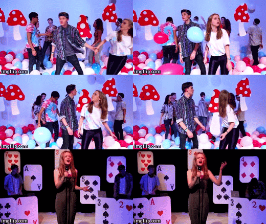
One way that the "festival" "party" element of the branding can be seen throughout all texts, is through the use of powder paint. Powder paint fights are becoming a popular activity at festivals thus an image associated with this lifestyle. Powder paint is incorporated in our bands' logo, as it represents the brand. The logo is present on the album cover and website. The music video also focuses on representing the "party" element of the brand as it features a powder paint fight, as well as young people having fun dancing in a room full of balloons.

Here's how we used typography to create a style adaptable across all platforms in order to create a clear sense of branding...

The purpose of having a well designed synergistic campaign is to show and convince the target audience that the music is something that will fit in and complete their lifestyle and should listen to and buy.
Here is a video of me explaining how our website brings all the different platforms together and how we created a marketing campaign that would reach our specific target audience.
The Band's Brand
The branding of the artist is reflected across the music video, digipak and website.
What kind of campaign have you constructed to both reach and appeal to your specific audience?
We studied the marketing campaign for Clean Bandit, an artist also of the electric music genre.
 |
| Music Video |
We thought the success of Clean Bandit's marketing campaign was partly due to the how their different texts-the website,album cover, music video and merchandise all work together in synergy.
How our brand is portrayed over all texts
Powder paint
Here's how we used typography to create a style adaptable across all platforms in order to create a clear sense of branding...
The purpose of having a well designed synergistic campaign is to show and convince the target audience that the music is something that will fit in and complete their lifestyle and should listen to and buy.
Here is a video of me explaining how our website brings all the different platforms together and how we created a marketing campaign that would reach our specific target audience.
How effective is it?
I think in theory our marketing campaign would be successful- there is a clear branding across all texts, and marketing strategies designed with a particular target audience in mind.
3. What have you learned from your audience feedback
Audience
The uses and gratifications theory suggests audiences consume media to gratify their need to identify, be entertained, to learn and for social integration. Following this theory, we researched into our chosen audiences' identity, in order to help create a music video that would best target them.
Who is the audience for the pop/dance genre?
Dance music translates well live, in clubs and festivals as it is easy to dance to therefore part of the way in which fans of the dance music genre consume their music and experience it will be through live events. Part of the reason why people are fans of this genre of music is for this social aspect of festivals and clubbing.
Although it is typically popular with youth, fans of dance music stretch throughout a wide variety of ages especially adults who were the prime audience when acid house music became popular in the 80's.
The common denominator throughout all age groups is enjoyment of the "live" music experience.
Our Target Audience
We chose to target our artist at the prime audience of dance music, the 16-24's. The following "Loupe" shows a number of pictures that show the lifestyle of the target audience, hover the mouse over each pictures to enlarge.
Primary audience: Prominently females, aged 16-24
Secondary: Males, aged 16-24
It was useful that we were part of our target audience age group as we could easily find people to give us feedback throughout the production stages. This was important as we often found ourselves surprised by audience response. For example when creating out logo, we arranged a focus group with some members of the target audience and asked whether they preferred dusty pink to blue, although the overall preference was blue, which we expected as it is more gender neutral, however a lot of boys preferred the pink to blue which we did not expect.

Feedback on the music video, album cover and website
Towards the end of our project, we showed our edit to a member of the target audience- Izzie, a 17 year old, interested in many genres of music including dance, and regular festival go-er, to see if there was anything we could add to improve our video and to see the response.
It was reassuring to hear that the use of colours was something that Izzie mentioned was good and memorable as we spent time specifically choosing the right colours in research and planning and were inspired by the use of colour in music videos.
When asked what could be improved she said that more time could be spent of the ending in order to make the narrative more clear.
When commenting on the website she said "The layout made things easy to find, especially tour dates." and that "Behind the scenes pictures and "about us" was a good insight into the band members."
And that the album cover "reflects the song" and "looks clean neat simple, and not tacky". I think that "reflects the song" is good feedback as it suggests that we successfully created a brand image that reflected the artists' music.
The full interview is below:
However this is just one persons opinion, in order to get a wider range of people to get more accurate overall feedback we made a survey.
In order to find out if we had successfully appealed to the target audience, in the survey we asked people what genre of music is their preference and whether they would listen to more songs by Lucid City based on the music video.
This is what we found out...
A new survey was carried out in which we asked what genre people thought the music video was, and there was a some confusion.

Dance music translates well live, in clubs and festivals as it is easy to dance to therefore part of the way in which fans of the dance music genre consume their music and experience it will be through live events. Part of the reason why people are fans of this genre of music is for this social aspect of festivals and clubbing.
Although it is typically popular with youth, fans of dance music stretch throughout a wide variety of ages especially adults who were the prime audience when acid house music became popular in the 80's.
The common denominator throughout all age groups is enjoyment of the "live" music experience.
Our Target Audience
We chose to target our artist at the prime audience of dance music, the 16-24's. The following "Loupe" shows a number of pictures that show the lifestyle of the target audience, hover the mouse over each pictures to enlarge.
Primary audience: Prominently females, aged 16-24
Secondary: Males, aged 16-24
Feedback Throughout Production
It was useful that we were part of our target audience age group as we could easily find people to give us feedback throughout the production stages. This was important as we often found ourselves surprised by audience response. For example when creating out logo, we arranged a focus group with some members of the target audience and asked whether they preferred dusty pink to blue, although the overall preference was blue, which we expected as it is more gender neutral, however a lot of boys preferred the pink to blue which we did not expect.
Feedback on the music video, album cover and website
Towards the end of our project, we showed our edit to a member of the target audience- Izzie, a 17 year old, interested in many genres of music including dance, and regular festival go-er, to see if there was anything we could add to improve our video and to see the response.
It was reassuring to hear that the use of colours was something that Izzie mentioned was good and memorable as we spent time specifically choosing the right colours in research and planning and were inspired by the use of colour in music videos.
When asked what could be improved she said that more time could be spent of the ending in order to make the narrative more clear.
When commenting on the website she said "The layout made things easy to find, especially tour dates." and that "Behind the scenes pictures and "about us" was a good insight into the band members."
And that the album cover "reflects the song" and "looks clean neat simple, and not tacky". I think that "reflects the song" is good feedback as it suggests that we successfully created a brand image that reflected the artists' music.
The full interview is below:
However this is just one persons opinion, in order to get a wider range of people to get more accurate overall feedback we made a survey.
In order to find out if we had successfully appealed to the target audience, in the survey we asked people what genre of music is their preference and whether they would listen to more songs by Lucid City based on the music video.
This is what we found out...
A new survey was carried out in which we asked what genre people thought the music video was, and there was a some confusion.
More people thought the genre was Pop then Electronic, this might have been due to the performance shots that we put in to challenge the conventions of the Electric Dance genre. However the fact that more people thought the genre was pop, would suggest to me that when challenging these conventions we needed to adapt them in a way that was true to the Electric Dance genre. For example, maybe Georgie should not have been in such heavy make up and glamorous styling.
4. How did you use new media technologies in the construction, research and planning, evaluation stages?
We used a wide range of new media technologies in research and planning, production and the evaluation.
An overview of all the technologies we used
I have chosen to focus my answer on which technology I thought had the most significance in Construction and Research and planning.
The convergence of web 2.0 with portable technology such as mobile phones, made social media a great way to communicate with each other instantly in the research and planning stages. We created a group page on Facebook to share web links and ideas and set up a group chat for instant messaging.
We all either have smart phones or check Facebook once a day so it was a good place to remind each other of shoots...

Screenshot from the our Facebook chat group, example of how we used it to share ideas...

Social media was not solely exclusive to research and planning- we used it throughout the process.
For example we used it in Construction, when creating a marketing campaign for our artist, the direct nature of social media that allows you to target specific groups and the fact that it is free made it an ideal for marketing.
However it is very expensive so could only be used in the seaward studio which meant we had to use a different camera for scenes shot outside...
The powder paint fight was shot on two different days and we weren't able to gain access to the same camera both days. This meant that including the Go pro, there were three different quality cameras used to shoot this scene.
The durability of a GoPro that makes it different to other cameras was great for the powder paint fight as it meant we didn't have to worry about getting paint on the lens. This combined with it's ability to shoot in slo mo produced some visually interesting footage.
With the benefit of hindsight we would not recommend combining these 4 cameras for the music video form. Music videos are fast paced and the use of such different quality cameras made our video look disjointed at times.
Creating the overlaying look by adding key frames and changing the opacity was not a skill that I was well acquainted with until creating this video. Also although creating "flckery editing" was created using all the basic premier pro tools (razor tool) it was a creative way of making the most out of the tools in a way that I had not yet thought of.
An overview of all the technologies we used

I have chosen to focus my answer on which technology I thought had the most significance in Construction and Research and planning.
Research and Planning: Social Media
The convergence of web 2.0 with portable technology such as mobile phones, made social media a great way to communicate with each other instantly in the research and planning stages. We created a group page on Facebook to share web links and ideas and set up a group chat for instant messaging.
We all either have smart phones or check Facebook once a day so it was a good place to remind each other of shoots...
What made the Facebook group better then the chat tool, was how it was easy to post a large number of photos, that we could easily access and other people could comment on...
 |
| Sharing and commenting on photos |
Screenshot from the our Facebook chat group, example of how we used it to share ideas...
Social media was not solely exclusive to research and planning- we used it throughout the process.
For example we used it in Construction, when creating a marketing campaign for our artist, the direct nature of social media that allows you to target specific groups and the fact that it is free made it an ideal for marketing.
iPads
The portability of ipads made them ideal to use to access the internet in group meetings as it meant we could sit round the tables, rather than the computer room and not be distracted by other people or editing etc.
Construction: The Cameras & Studio
We used a range of cameras of different quality in the production of our video; the Canon 5D, Canon 500 D and the GoPro.
All shots in the studio were filmed on the Cannon 5D.
 |
| Cannon 5D |
This was the camera with the highest resolution that we had in the school and you can tell the difference in the quality of footage. Furthermore its digital capabilities allowed us the connect the camera to a monitor so that the whole group could easily watch back our footage on a big screen which was very useful.
However it is very expensive so could only be used in the seaward studio which meant we had to use a different camera for scenes shot outside...
The powder paint fight was shot on two different days and we weren't able to gain access to the same camera both days. This meant that including the Go pro, there were three different quality cameras used to shoot this scene.
 |
| Go Pro |
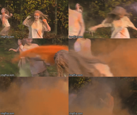 |
| Camera 1- worse quality |
 |
| Camera 2 - better quality |
With the benefit of hindsight we would not recommend combining these 4 cameras for the music video form. Music videos are fast paced and the use of such different quality cameras made our video look disjointed at times.
Post Production- Adobe Premier Pro
We used Adobe Premier Pro for the editing of the music video and all other videos made in the process such as the behind the scenes footage for the website. This technology allowed us to achieve the look of the electric dance music genre, through the various effects we created...Creating the overlaying look by adding key frames and changing the opacity was not a skill that I was well acquainted with until creating this video. Also although creating "flckery editing" was created using all the basic premier pro tools (razor tool) it was a creative way of making the most out of the tools in a way that I had not yet thought of.
Evaluation- Blogger
The evaluation is presented on blogger. Blogger's HTML format makes it easy to embed different web tools, such as powerpoint presentations, gifs, mind maps, slide shows, videos... This meant we could present our answers in the most effective way to answer a question that often regards a video or website, that we would not be able to present as effectively on paper.
It's disadvantages were that our work does not physically exist- and is out of our hands, for example if your laptop suddenly crashes and you have not save your work.
However I think that overall the pros out weigh the negatives due to the many new options that online provides.
It's disadvantages were that our work does not physically exist- and is out of our hands, for example if your laptop suddenly crashes and you have not save your work.
However I think that overall the pros out weigh the negatives due to the many new options that online provides.
Friday, 19 December 2014
Revising the Album Cover
Changes
Colours
In order to make the colour scheme more distinct we decided to have one colour of power paint on the title and spine instead of mixed.We made sure these were the same shades of blue and pink as the website.

Back Cover
We added a QR code, made using a QR code generator, in which you type in the website url to get the image.
We also added copyright information in small text underneath and a link to the Twitter page to create synergy and encourage the use of social media.

Editing Feedback
Test Edit
Once we had all our footage in place, edited to the music and had improved on previous feedback, our final (test) edit was ready to be reviewed.Feedback
- 1:48-1:54 Too much going on, too many overlays
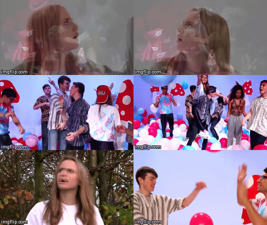
We decided to take the second layer of video off these close up shots.

- Introduction to forest scenes (1:05-1:11) could be made clearer.
In order to establish the introduction of the powder paint scene in the forest, we decided to overlay archive footage from Alice in Wonderland (1951, film) where she enters the forest, over this shot as done before with the rabit hole sequence.
Website Interactivity
It is important that the website encourages audience involvement with the band, is informative and provides purchasing opportunities. When improving the website these were the key things we focused on.
Competitions
Competitions are a good way to involve the fans and give them something back. We thought a festival inspired competition would be good for our target audience. The competition we created required fans to send in their best festival pictures, to have the chance of winning two free vip tickets to Lovebox festival (a day festival in London targeted at 16-24's). There will be a photo archive of everyone's submitted photos, encouraging fans to interact with each other. Our competition is advertised on the home page.

"Membership"
There are gadgets in the Wix App Market that offered opportunities for audiences to sign up for updates.

Purchasing Opportunities
It is conventional for the website of an artist to work to promote and sell their latest album. This was something that we had not yet incorporated into our website. We worked to integrate this into our Home and Music pages.
 |
| Music page |
Tuesday, 16 December 2014
Target Audience Feedback
Reaching the end of our project, we showed our edit to a member of the target audience- Izzie, a 17 year old, interested in many genres of music including dance, and regular festival go-er, to see if there was anything we could add to improve our video and to see the response.
It was reassuring to hear that the use of colours was something that Izzie mentioned was good and memorable.
Impovements to be made- more focus on ending, making it clearer.
I also showed her the Website and Album Cover...
Website
"The layout made things easy to find, especially tour dates."
"Behind the scenes pictures and "about us" was a good insight into the band members."
Album Cover
"reflects the song"
"looks clean neat simple, and not tacky"
The full interview is below:
It was reassuring to hear that the use of colours was something that Izzie mentioned was good and memorable.
Impovements to be made- more focus on ending, making it clearer.
I also showed her the Website and Album Cover...
Website
"The layout made things easy to find, especially tour dates."
"Behind the scenes pictures and "about us" was a good insight into the band members."
Album Cover
"reflects the song"
"looks clean neat simple, and not tacky"
The full interview is below:
Sunday, 14 December 2014
Editing feedback
We screened our edit to Gavin, fellow media peer, to hear his views from both a member of the target audience and a technical "media student" perspective
Merchandise
Upon doing some research into other artists targeted at the young adult age group (from 17-24) unisex but prominently female, I found other than the standard T-shirt and CD, some niche items such as beanies and iphone cases.


T-Shirt
The splattered powder paint on our white t-shirts after filming the paint fight inspired us when creating our artist t-shirts.

 |
| t-shirt after powder paint fight |
Baseball shirt option
We decided to have an alternative to the plain short sleeved t-shirt, I noticed this on the Ellie Goulding website, which is targeted at a similar audience to our artist. The baseball style shirt is popular at the moment and has a large appeal to a tom boy audience. Here we also continued with the powder paint theme, but without the splatters all over as that would look too busy.
Record
Beanie
We thought this would be nice for our audience as it is unisex, however we have also made a pink option because some girls might want a more girly one.
Iphone Case
Iphones are immensely popular within the age group we have targeted at, therefore we have put our splattered paint branding onto an iphone design.
Poster
Editing
middle section (01:48-02:04)
One option we tried was to fade to black between performance and balloon scenes.
To do this we added a key frame and lowered the opacity:

This is a brief section of what it looked like:
(0:06-0:11)
(0:06-0:11)
We were not satisfied with this effect, and continued to explore alternatives
Grading
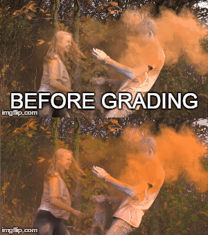
As highlighted in the feed back given to us after viewing a rough edit, there is a significant difference in the aesthetic of the scenes filmed in the studio (balloon and performance) with the forest scene that is filmed out doors, due to the lighting that the control of the studio allowed us. Therefore the grading would be vital to try and reduce this gap.
This meant using the Procamp and Three Way Colour Wheel tools to try and bring out the colours of the paint fight.
 .
.
This meant using the Procamp and Three Way Colour Wheel tools to try and bring out the colours of the paint fight.
Album Cover
Front
The focal image was created by layering two images on top of each other at slightly different places and lowering the opacity, creating a blurred effect. The image is composed with Georgie in the middle and the two boys on either side, which works to establish her as the singer.
The album is self titled therefore the main text on the cover is the artist name. This is in the same font as the website, however we decided to use the powder paint differently- reversing it so that the font itself is made up of paint, as this worked better with the composition of the cover.

Although we were aiming to achieve a minimal aesthetic when creating this cover, when receiving feedback from peers it was suggested to add a texture to give it more depth. We experimented with overlaying images of lighting from live performances as this tied in with our genre nicely:

Feedback from 16 year old male "looks a bit david bowie wouldn't buy"

"I like the image of the artist but the font does not compliment it well" - from same person as above
However we concluded that the initial plain duplicated effect was enough and when speaking with member of our target audience (as opposed to peers) they confirmed this decision saying it was they preference.
Back
Continuing with our running theme of powder paint, we decided we wanted to have powder paint smudges with the track titles on top. After discussing with Chris (the technician) we decided instead of taking photos of powder paint we could download a "smudge" tool for Photoshop off the internet. These came in a variety of smudges that you could re size to get the shape you wanted.
Inspired by the simplicity of Disclosure's album we decided to align out track titles in the center furthermore it corresponded nicely with the front cover which is also aligned through the middle.
 |
| aligned in the center |

It is important that both the album cover and website used the same fonts to create a clear branding. These fonts we decided on were"Mad Zombies" for the artist name and "Arial" for the body text. I found these fonts complimented each other well with "Arial" being simpler and easy to read and "Mad Zombies" more exciting and interesting.
 |
| example text from website- same fonts on album cover |
Production company logo
It is conventional for the back of the album cover to feature production company logos. Our production company is called Technicity, a branch off Universal, that specialises in the dance music genre. When creating their logo I took this genre into consideration being the main inspiration behind decision of font and image.

Middle
The CD will be covering the right side therefore we decided to place the boys here as they are positioned on opposite sides leaving space in the middle for the CD. This also continues to establish Georgie's role as singer and front woman, as she is placed separately on her own page.
The composition of the photographs, in particular Eugene and Gavin, continues to follow the theme of aligning in the middle as shown on the front and back cover.

Editing- Narrative Change
Opening Sequence
When story boarding and making our animatic we planned for the opening scene to show Georgie (protagonist) walking through a field and finding a tunnel which she enters and leads her too the white room and the cupcake. On editing we soon realised there was not enough time for all of this to happen and since we were no longer shooting the powder paint fight in the forest with the tunnel we decided to axe this scene.Neon scenes
We originally wanted some close up performance shots of Georgie in neon. We soon discovered the complications this brought about and we did not have enough black light equipment to do so. Therefore a good alternative was to invert the shot in editing to create a similar effect. We played around with this and the results were as follows...Although it created a neon effect that with the right make up could look like glow in the dark paint, we decided not to put this in.
Revising the website
Evolution of the website:


First
 |
Second
The main difference here being the new banner.
 |
| second |
Third (and final)
We found that a significant improvement was made when chosing a clear theme and font that ran across all the pages.
This grey, block theme is continued across all pages, for example the tour...
Subscribe to:
Posts (Atom)