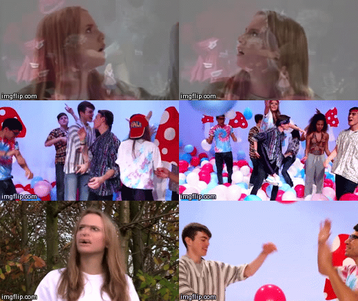
Our Music Video

Our Band Website

Our Band Website
Click on the image to get to the website

Our Album Digipak- Back and Front

Our Album Digipak- Back and Front

Our Album Digipak- Middle

Our Album Digipak- Middle

Friday, 19 December 2014

Revising the Album Cover

Changes 

Colours

In order to make the colour scheme more distinct we decided to have one colour of power paint on the title and spine instead of mixed.We made sure these were the same shades of blue and pink as the website.


Back Cover

We added a QR code, made using a QR code generator, in which you type in the website url to get the image.  
We also added copyright information in small text underneath and a link to the Twitter page to create synergy and encourage the use of social media.


Editing Feedback

Test Edit

Once we had all our footage in place, edited to the music and had improved on previous feedback, our final (test) edit was ready to be reviewed.


Feedback


  • 1:48-1:54 Too much going on, too many overlays 


We decided to take the second layer of video off these close up shots.


  •  Introduction to forest scenes (1:05-1:11) could be made clearer. 

In order to establish the introduction of the powder paint scene in the forest, we decided to overlay archive footage from Alice in Wonderland (1951, film) where she enters the forest, over this shot as done before with the rabit hole sequence. 


Website Interactivity

It is important that the website encourages audience involvement with the band, is informative and provides purchasing opportunities. When improving the website these were the key things we focused on.

Competitions


Competitions are a good way to involve the fans and give them something back. We thought a festival inspired competition would be good for our target audience. The competition we created required fans to send in their best festival pictures, to have the chance of winning two free vip tickets to Lovebox festival (a day festival in London targeted at 16-24's). There will be a photo archive of everyone's submitted photos, encouraging fans to interact with each other. Our competition is advertised on the home page. 


"Membership"


There are gadgets in the Wix App Market that offered opportunities for audiences to sign up for updates. 


Purchasing Opportunities 


It is conventional for the website of an artist to work to promote and sell their latest album. This was something that we had not yet incorporated into our website. We worked to integrate this into our Home and Music pages.  

Music page


Tuesday, 16 December 2014

Target Audience Feedback

Reaching the end of our project, we showed our edit to a member of the target audience- Izzie, a 17 year old, interested in many genres of music including dance, and regular festival go-er, to see if there was anything we could add to improve our video and to see the response.

It was reassuring to hear that the use of colours was something that Izzie mentioned was good and memorable.

Impovements to be made- more focus on ending, making it clearer.

I also showed her the Website and Album Cover...

Website

"The layout made things easy to find, especially tour dates."

"Behind the scenes pictures and "about us" was a good insight into the band members."

Album Cover

"reflects the song"
"looks clean neat simple, and not tacky"

The full interview is below:


Sunday, 14 December 2014

Editing feedback

We screened our edit to Gavin, fellow media peer, to hear his views from both a member of the target audience and a technical "media student" perspective

Merchandise

Upon doing some research into other artists targeted at the young adult age group (from 17-24) unisex but prominently female, I found other than the standard T-shirt and CD, some niche items such as beanies and iphone cases.

T-Shirt


The splattered powder paint on our white t-shirts after filming the paint fight inspired us when creating our artist t-shirts.

t-shirt after powder paint fight


Baseball shirt option


We decided to have an alternative to the plain short sleeved t-shirt, I noticed this on the Ellie Goulding website, which is targeted at a similar audience to our artist. The baseball style shirt is popular at the moment and has a large appeal to a tom boy audience. Here we also continued with the powder paint theme, but without the splatters all over as that would look too busy. 


Record 


Beanie


We thought this would be nice for our audience as it is unisex, however we have also made a pink option because some girls might want a more girly one.


Iphone Case


Iphones are immensely popular within the age group we have targeted at, therefore we have put our splattered paint branding onto an iphone design. 


Poster


Editing

middle section (01:48-02:04)


This is the section where the song reaches a crescendo, increasing its pace, to a climax in which it slows down completely. We planned to have our neon section here, switching between neon and normal for the different lyrics "hey" and "heart beat moving" and then to slo mo pinata exploding. However since we made the decision to axe the neon scene, we had to play around with out footage to try and find an alternative.

One option we tried was to fade to black between performance and balloon scenes.

To do this we added a key frame and lowered the opacity:


This is a brief section of what it looked like:

(0:06-0:11)


We were not satisfied with this effect, and continued to explore alternatives